Project Ice Cream
Our Team
P10 - Hi-Fi User Testing
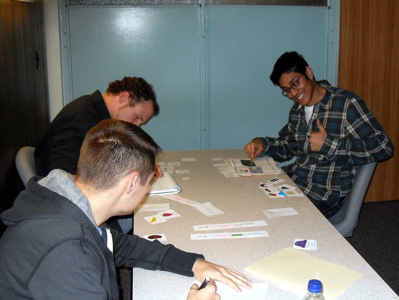
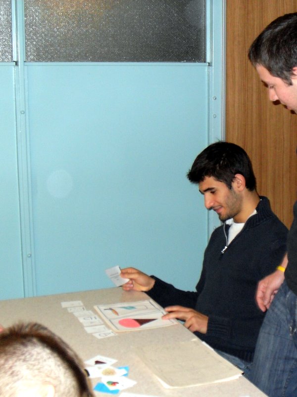
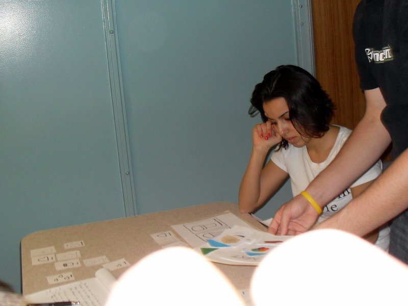
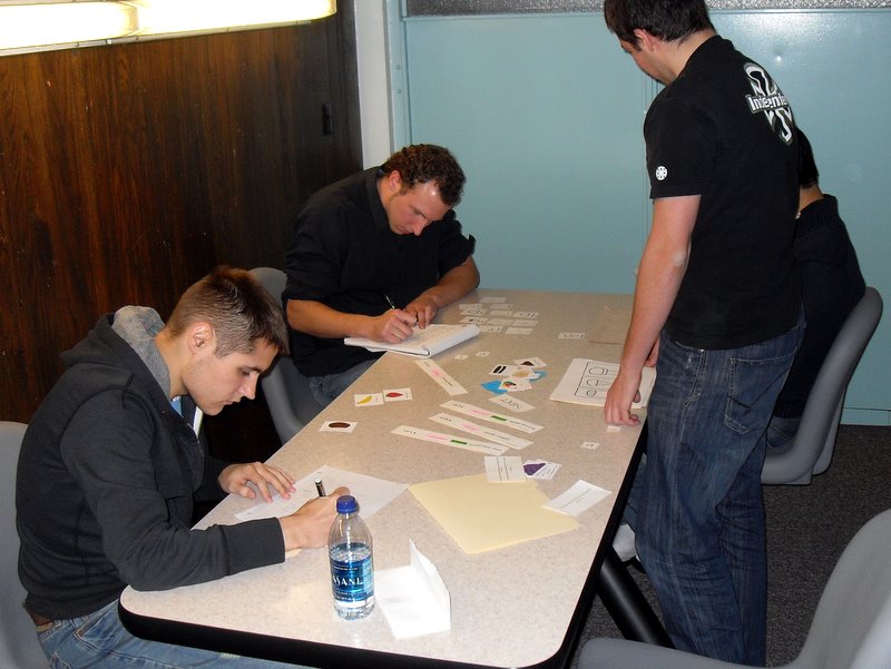
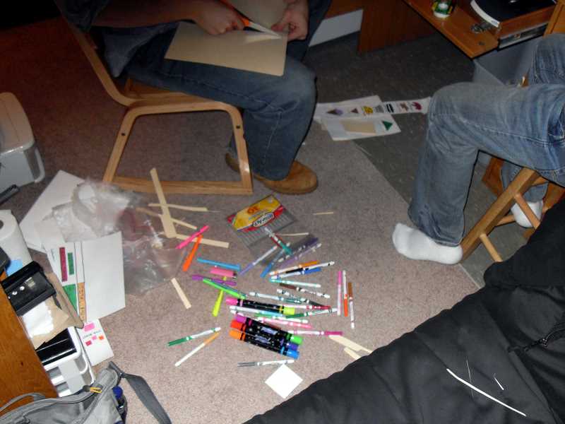
The test for our hi-fi prototype took place on a lap top in an area similar to the area we tested our lo-fi prototype. Since we were required to only subject one user to a test we decided to put them through all 23 of our pre determined tests. These are identical to the ones that we used in P7 of this project. We figured this would be a good idea since our revisions between the lo-fi and hi-fi prototypes were directly addressing issues we found in our lo-fi prototype.
The user ( who wishes to stay nameless) was able to complete all 3 tasks with relative ease. There were a few hiccups on the medium and difficult tasks, however these hiccups are minor and will be discussed below.
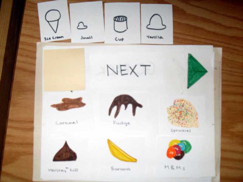
Simple Task:
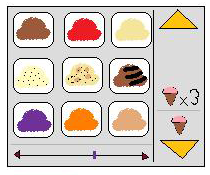
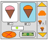
The user chose ice cream correctly, the user then chose the cone, hit next, chose vanilla, hit next then hit submit order. This task went extremely smooth. Even though the user may not have been completely familiarized with the system there were enough affordance built into the system for the user to wade his way through it unscathed.
Medium Task:
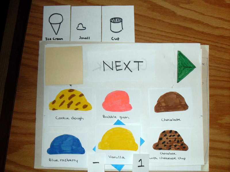
Again on this task the user started out very smooth. He chose Ice cream and the cone correctly. When he got to the ice cream select screen he chose his ice cream flavor once and then hit the green arrow. This did not have the intended reaction and he sat back for a moment. He then quickly read the “1 choices remaining” label and said out loud “Oh, I need to pick another flavor… the same flavor again… ok.” Even though he had added the prompt text to this it was still possible for him to get confused making the ice cream selection. The rest of the order went perfectly.
Even though this happened it is likely an aberration. Since the user had just been subjected to a test prior and “praised” for doing so well it is likely he stopped thinking about his decisions and just made them arbitrarily. Had the user been more attentive to his duty then it is likely this would have been avoided all together. However since the people using this system may be sidetracked by other distractions and won’t always being giving their full attention it is likely that this could happen often. The text prompt does give a quick resolution to a common point of confusion but it doesn’t alleviate it entirely.
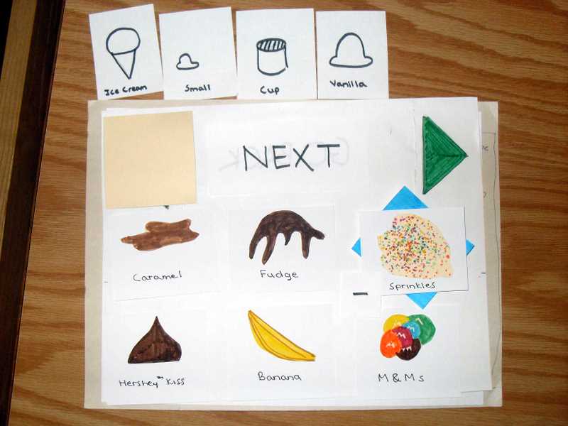
Difficult Task:
The difficult task was run flawlessly as well with the exception that the user couldn’t figure out how to modify an order. This had nothing to do with the user not understanding the system. The feature hasn’t been implemented yet and he was looking for a non-existent feature. This may not even be something worth mentioning however it is the only point of confusion the user had aside from a flawless run through.
P7 - High Fidelity Prototype
P6 - User Testing
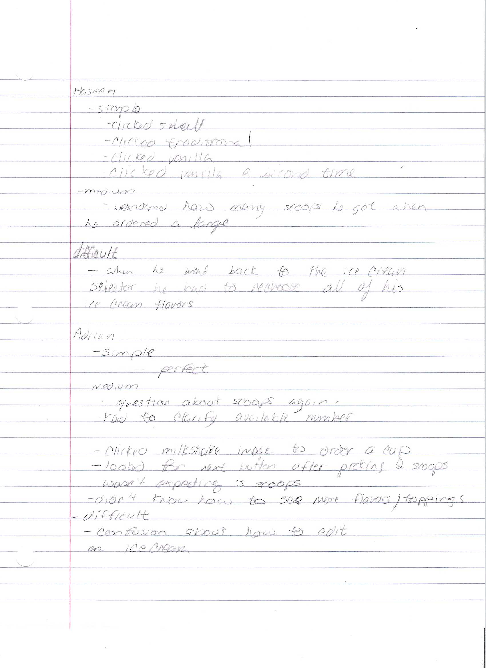
Our first user was Hasan, a Microbiology major. You can see that he really enjoyed using the system.
Our second user was Adrien, a Social Thought & Political Economy major.
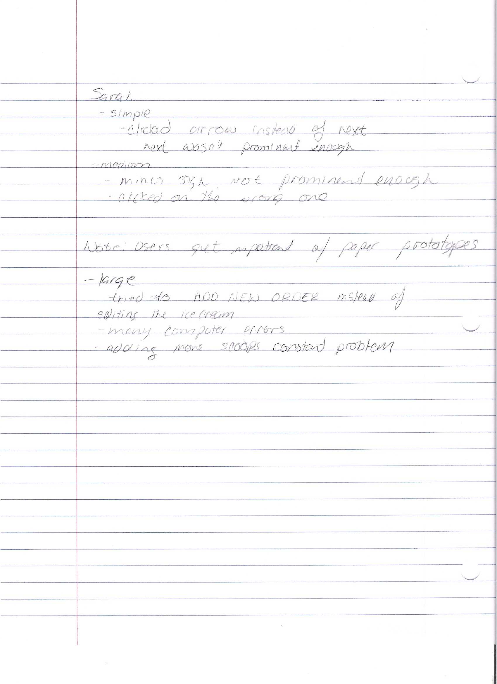
Our third user was Sera, a communications major.
After each user completed the three tasks, it turned out that they stayed and watched the other partipants (we made sure no one saw how the system was used before it was their turn though). By the time we were on our last user, the room had nine people in it: the three creators of the project, the three users, and two additional bystanders. Distractions definitely became an issue towards the end. This had the unintentional benefit though of simulating an actual ice cream store. Realistically, when you use a system like this, you're not going to be sitting in a silent room focusing soley on your task at hand. You're going to be in a potentially noisy store while ordering, as well as talking to your friends perhaps. In retrospect, we ended up getting very lucky with how our environment turned out as we got to see how our system performs when it is not the main point of attention, which is very likely how it could be used in practice.
Pay with cash.
Also order a large cup of mint ice cream and cookie dough ice cream
with strawberries and Oreos.
Pay with credit.
with sprinkles.
Before checking out, go back and change the scoop of vanilla to chocolate.
Pay with cash.
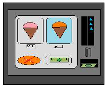
The first user Hasan became confused during the second test when choosing his ice cream flavors. He was unsure of how many scoops he got when he ordered a large ice cream. The number and the minus sign, accompanied with the picture of a large ice cream depicting 3 scoops int it were an inneficient means to describe it. Adrien, our second user, experienced the same problem on the same test in the same scenario. Out 3rd user, Sera, also experienced this problem on the same test case.
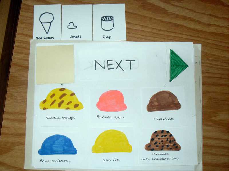
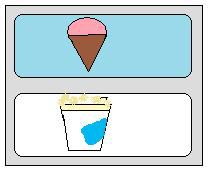
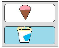
When Adrien did the second test case he was told to order a cup of ice cream. Out first page has a picture of a cup(to signify milkshake) and a picture of a cone(to signify an ice cream). Even though he was supposed to click on the ice cream cone to get a cup of ice cream he instead clicked the picture of a milkshake. Sera also pointed out this problem, but asked for clarification before clicking.
Two of our users also ran into the problem of figuring out how to and when to click "Next", Mark and Adam also pointed this out in class while they were demoing our system.
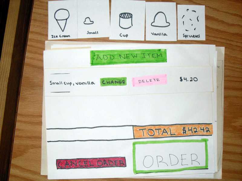
All three of our users also had a problem trying to figure out how to edit an ice cream. 2/3 of them (Adrien & Sera) clicked "Add New Item" to try to edit an existing ice cream. Hasaan ended up deleting his order before realizing he wasn't doing it correctly.
In general it was difficult for our users to understand the mapping of the "Next Button" and the green arrow, which offer completely different functionality. We believe this is because the buttons are are too close in proximity.
We want to add some sort of text prompt or status-text that will keep the user informed of how many scoops they have left to choose and/or if they can move onto the next step.
We also want to differentiate the pictures on the first screen so that a user won't think clicking the milkshake is the way to order a scoop of ice cream. This is especially important since the wizard is about the same in both use cases.
Our Next button is nested between the navigation buttons that allow a user to browse toppings/flavors. This proximity causes major confusion on the users part. They expect a green arrow to mean to go forward and that "Next" is the same thing. To fix this we are probably going to move the navigation buttons down to the bottom of the screne and the "Next" button may have some affect to signifiy its ready to go ie. blinking, highlighting appear/disappear.
To deal with the problem of users not knowing how to edit an ice cream the solution will most likley be to move the "Add New Item" button below all of the ice creams in their order. That way their eye motion should hypothetically find the "Modify" button before it finds the "Add New Item" button. Changing the colors/shapes of the buttons will also probably greatly help reduce this problem.
IN addition to this we may want to redesign small facets of and locations of items on our UI to accomodate the other changes we are making. But in general our design was intuitive so changing it too much could have drastic affects.
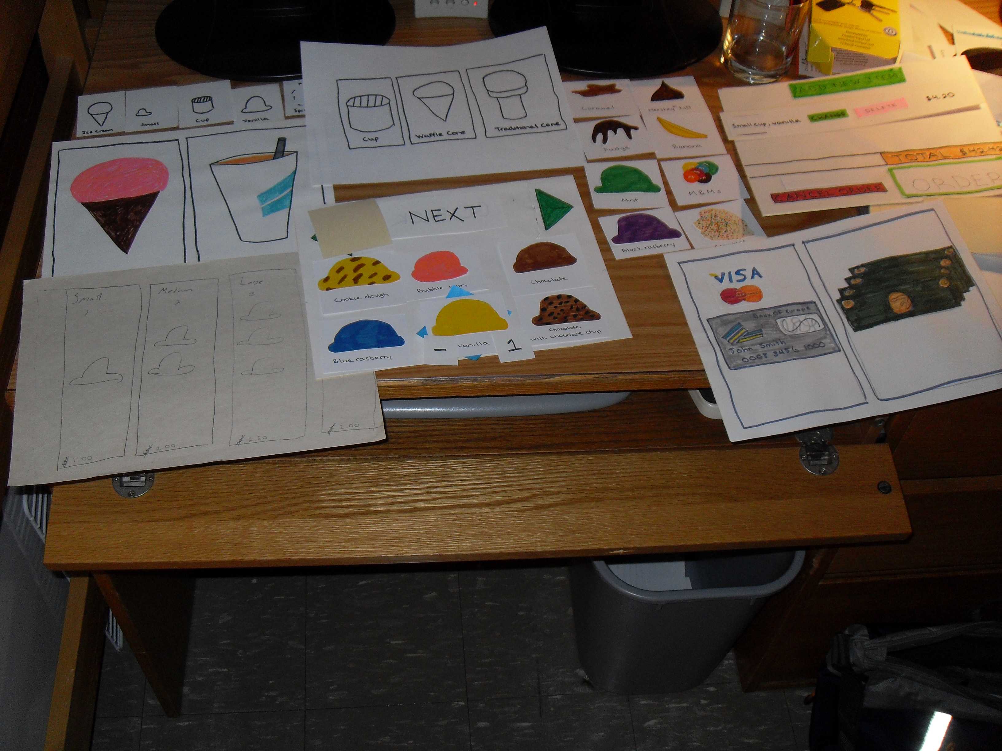
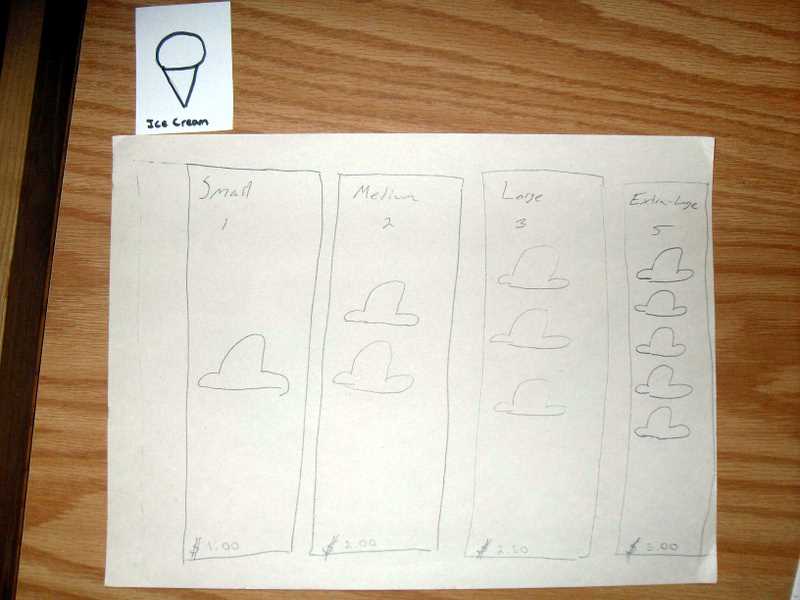
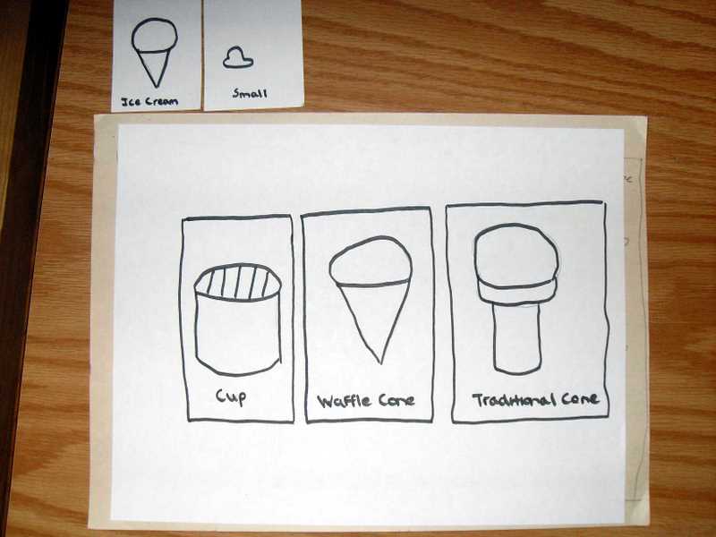
P5 - Paper Prototype
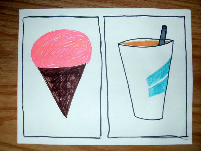
Individual Screens
Task Breakdown
P4 - Storyboards
Task 1 - Simple Task
The user chooses a cone (as opposed to a cup).
The user chooses a flavor.
The user finished building the order and reviews there selection
The user pays via credit or cash using the system itself to pay.
Task 2 - Medium Task
The elderly man chooses a cone for his wife wants.
The elderly man chooses a flavor for his wife.
The elderly man is then asked to confirm his order, instead he chooses to add another item. He repeats the ice cream building wizard a second time for his order.
The elderly man pays for the ice cream the same way he swipes his debit card if the grocey store.
Task 3 - Difficult Task
The father chooses a cone for his son.
The father chooses a flavor for his son.
The father is prompted to finish and pay, instead he adds another ice cream to the order... and another... and another. Then his daughters want root beer floats.
The father finishes the order and pays for it using the family credit card.
P3 - Project Proposal
Our initial idea was going to be focused around two distinct user groups: people who order ice cream and the servers who serve the ice cream. After talking to several servers however, we found that in all cases they liked their existing interfaces, so we scrapped that part. No sense in doing something over that’s already been done well – that would just be setting us up to look bad. We would more likely end up designing something worse than what they already use.
So our project will now focus completely on the ordering of the ice cream from the patrons’ points of view. This will allow us to spend more time on a system that would generally require more thought than normal. Since the interface could potentially be used for the first time by many new users every day, some with no technical skills, it has to be intuitive enough the first time around that users can just pick it up.
- The need we are trying to address is the confusion and time waste when people order ice cream. Anyone ordering ice cream at any ice cream store can fall into the category of our user. This ranges from an eight year old spending his allowance to a seventy-six year old retired Wall Street executive out on a date with his wife. Since going out for ice cream is a national/international pastime, we can’t easily generalize our user base to any particular demographic.
- We couldn’t find any existing solution to our problem from the customer’s point of view. We did however encounter a well designed existing system already in place for the ice cream servers; hence we dropped our initial decision to design two distinct, but integrated systems.
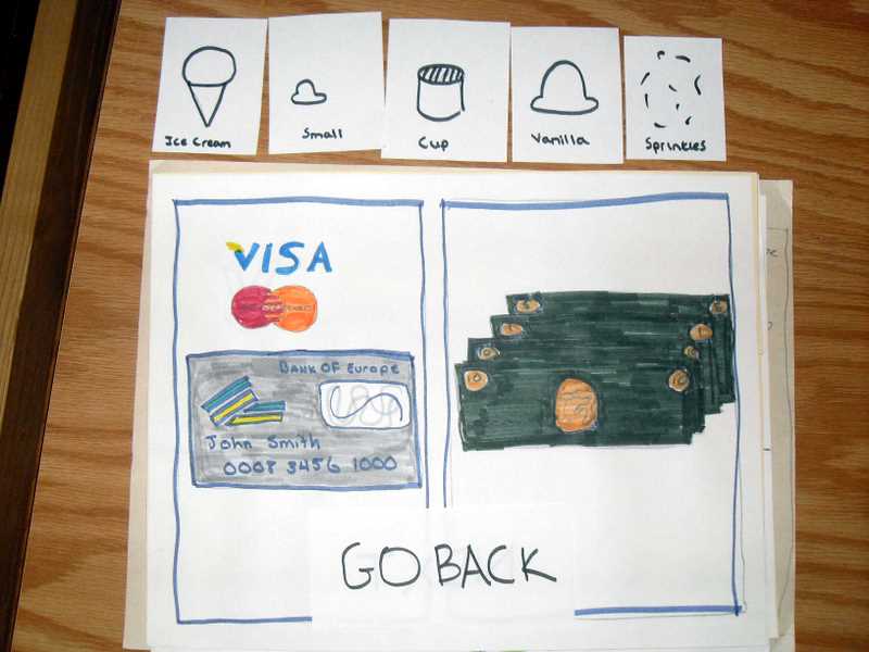
- The core of our system is simply a mechanism for users, ice cream store patrons in this case, to place their orders through a computer interface. With ice cream being a recreational activity, the interface must be simple and easy to use. After leaving the store, customers should be looking forward to another positive and fun experience as opposed to dreading coming back and having to deal with a clunky interface again. Aside from obviously being able to purchase ice cream, users will be able to view other food items the store may offer. All items will also include pictures to help guide user’s choices. The interface for ice cream will have the most options and will therefore be the most intricate, requiring various flavors, toppings, and cone and cup sizes. Once an order is complete, the user will have an option to pay with either cash or credit card. They can of course go back and modify their order at any point before this – payment is finalization and confirmation.
-
An easy task would be for an average person (has had exposure to computers and other associated technology) to place an order for an ice cream and pay with their credit card.
A medium task would be for a senior citizen who has extremely little, if any at all, exposure to technology to place an ice cream order for them and their spouse. The goal of this task is to verify that non-technical users are not intimidated and can hopefully learn on the fly.
A hard task would be for a single adult to visit the ice cream store with their child and a group of their friends. The order will be complicated because all of the children want different flavors and toppings. The added distraction of watching all the children as they order is a further test on the usability of the interface. This task mostly serves to make sure our interface performs well when we are competing for the user’s attention. We do not want our interface to be so complicated that it requires complete concentration or even a quiet room.
P2 - Contextual Inquiry
Ben & Jerry's
We interviewed three customers at Ben & Jerry’s, two females and one male. None of them had ordered ice cream in Amherst or at that Ben & Jerry’s before. They all said that they pretty much know what they want before-hand but frequently change their mind while in-line or at the server ordering. When the three were asked how they feel about ordering ice cream through an interface they all decided it was a good idea, assuming no one would lose their jobs to a machine. They said however that they would only prefer this system if it somehow sped up the time it takes to receive their ice cream in-hand. When asked if this would useful for ordering specials they said it would be a great idea. One point of concern for all of them was that many people may not be tech savvy enough to use a GUI and/or able to read English. They said that the ability to use it in English(Primary) and possibly Spanish(Secondary) would be a good feature to consider. They worried that users who couldn’t use the interface effectively would slow down the entire process; if there is a line behind this inept-user then these people could possibly spend more time waiting to order than they would’ve saved by using the system. They did feel a ticket ordering system would appease them if they were able to just sit down and order when they got in.
We also interviewed the Ben & Jerry’s employee working at the time. His feelings towards a GUI ordering interface were mixed. Ben & Jerry’s already offered him a system in which he was relatively pleased with. He said that on a typically cold (autumn) day there weren’t many orders to fulfill, to the point where the GUI may in fact slow down order processing for him(an experienced ice-cream server). He did say however that during the summer months and early autumn that business boomed and his average orders per hour increased ten-fold. In this situation he said that having customers queue up their orders in a machine may allow him to do them quicker. During the interview he mentioned that one of the largest time-consumers during a typical order was the customer making up his mind about which ice cream they wanted and that very often a customer would change his order after he/she makes up his/her mind.
“It takes me a couple seconds to fill up a cone, a minute at most to make a Sunday, but a customer can sit there forever trying to make up his mind.” -- Ben & Jerry’s Employee
When asked if the GUI Ordering system would improve service during busy times he said almost undoubtedly yes especially with those particularly indecisive customers.
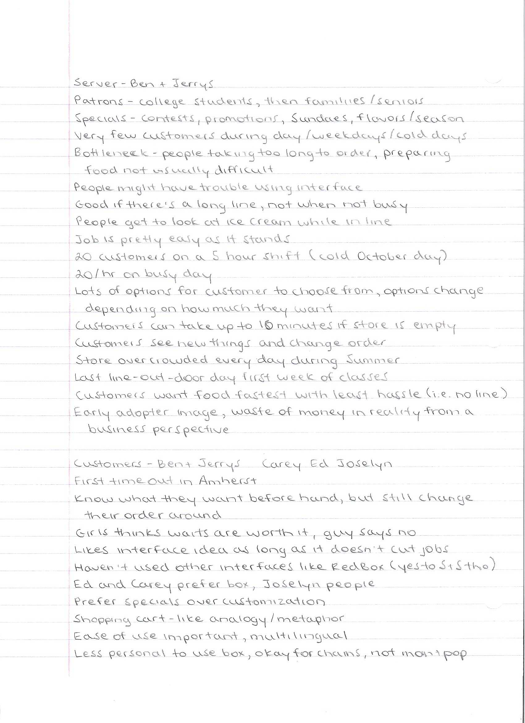
Ben & Jerry's Setup Images
Scan of Notes (1)
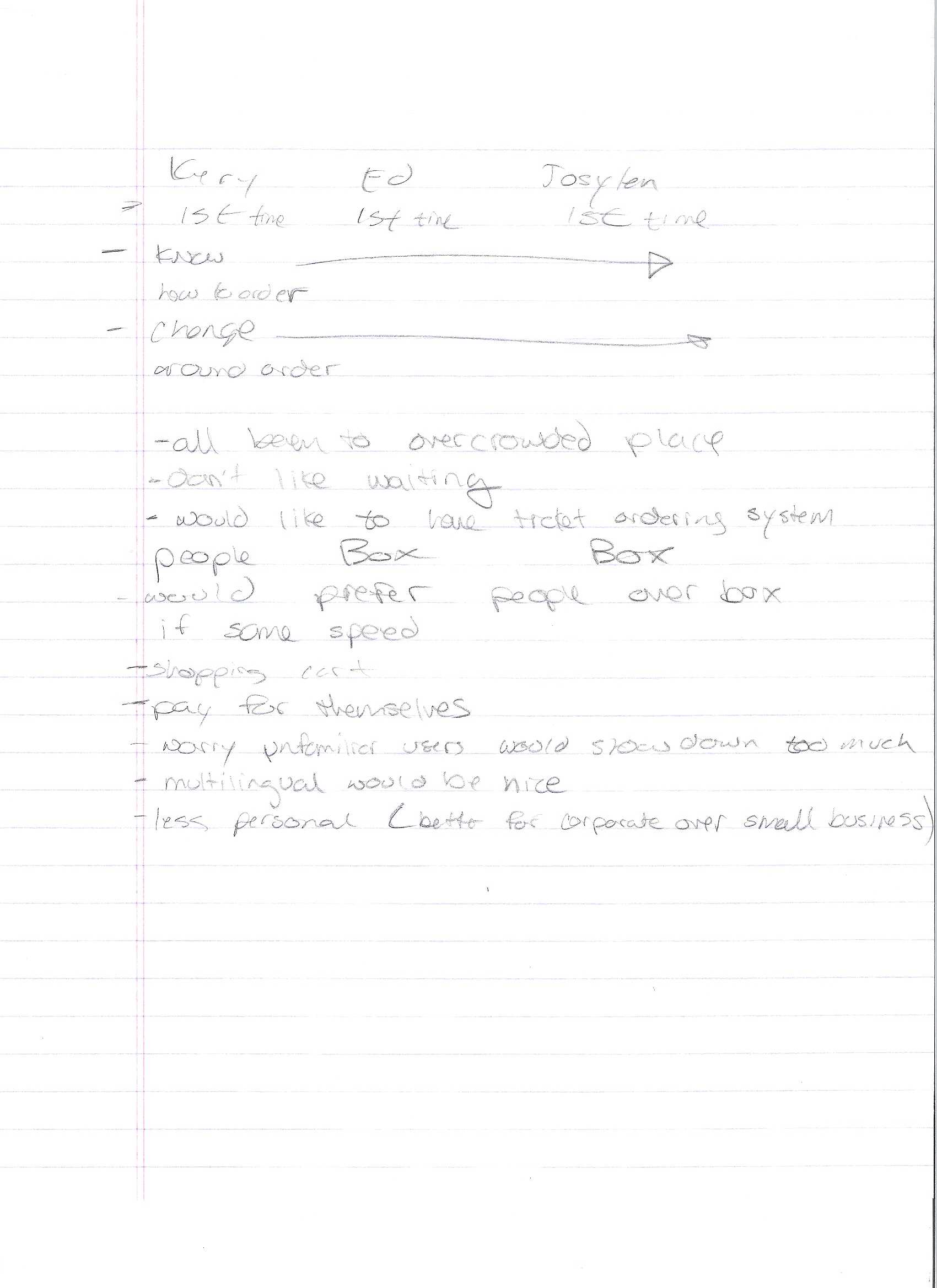
Scan of Notes (2)
Write-up (.doc)
Bart's Ice Cream
We interviewed two employees at Bart's - Lisa and Allison. The interviews lasted around 10 minutes each.
Lisa had been working at the store for awhile. She identified customers as the biggest bottleneck, mostly because they tend to be indecisive about what they want to order. Customers also have a tendency to change their minds apparently. She mentioned that the monitoring system the store already has in place to track orders and such is actually very good at what it does. In terms of actual ice cream, there are lots and lots of toppings obviously, but instead of there being a button for each one, their system has different classes of topppings for them to select depending on the price. Lisa thought that the sort of process we proposed could potentially be much faster, but because they are a small family restaraunt, many of their customers desire human interaction and might not want to use a touch screen (or might not be capable - older crowd).
Allison had only been working at Bart's a couple days and so didn't have much experience. The days she had worked were relatively slow, so she wasn't able to provide as much insight into bottlenecks as Lisa was. However, as a self-described "technically challenged" person, she echoed Lisa's thoughts on the existing employee interface for managing orders, saying that it was very easy to use and that she liked it. She mentioned some difficulties memorizing how to make all the various Sundaes the store offers though. She also suggested for the customer interface that we show actual pictures of what they'd be buying since looking through the glass at the ice cream is such a big part of the experience.
There seemed to be a general theme throughout Bart's (Ben and Jerry's too) that the existing interfaces for employees are already pretty well done. This seems to lend to us narrowing our scope to the customer interface - no sense in trying to redo something that's already been done well. There is definitely some room for improvement on the employee side though if we decide to pursue that still. Some sort of Sundae guide for new employees might be useful for instance (or other more complex orders).
Bart's Ice Cream Setup Images
Scan of Notes
P1 - Our POV
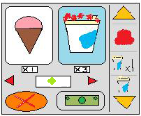
Our project is going to be an automated ice cream ordering system. It will be used both by customers and employees, to place orders and fill orders, respectively. Each user group, customers and employees, will access the system through a simple touch screen. The goal of this project is to minimize customer wait time and maximize employee efficiency, therefore increasing profit.
Customers will interact with the system to pick out and place their order. For ice cream, they will be able to choose from various flavors, toppings, cones, cups, and sizes. Other food items such as milk shakes, smoothies, and fraps will also be available. People from all walks of life enjoy ice cream, so we will be making zero assumptions about the computer literacy of the customers. The interface must therefore be very approachable and extremely intuitive, much like the redbox movie rental machines. Under no circumstances should a customer need help to advance.
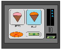
Employees will also have access to a separate interface which displays a queue of orders placed. While this is going to be relatively simple compared to what the customers will be seeing, we can assume the employees will have some training. Consequently, we can set the bar a little higher and make a few assumptions about this user group. So while the employee interface must still be clean and easy to use, it does not necessarily need to be as basic.
Test groups will obviously fall into two categories: customers and employees. For customers, we will test people of all ages, professions, and gender. We will not give them any advance instruction on how to use the system – just like how it would be in actual operation. The idea is that virtually anyone could potentially use this system, so we want to make sure it caters to as many people as possible. As for employees, we will focus more on the younger crowd you tend to see working at ice cream shops. In this case, we can provide a little advance instruction, similar to employee training. Employees should still be able to get around the system with relative ease though.
POV (as .doc)