project 1 - doors
Introduction
With over 24,000 students, UMass Amherst's W.E.B. DuBois Library is easily one of the campus's busiest locations. With so much daily traffic, you'd expect the automatic sliding doors to be very people-friendly, right?
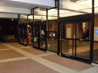
Wrong. I camped outside the doors pictured to the right for 45 minutes one evening and observed a number of people who misused them.
The Data
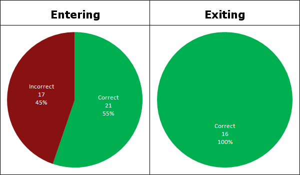
My stakeout was on Tuesday, September 16, 2008 from 6:35pm-7:20pm. In this time period, I observed 54 people, 38 entering and 16 exiting. Curiously enough, all of the errors I observed were made by people entering, not exiting. More about this in the next section.
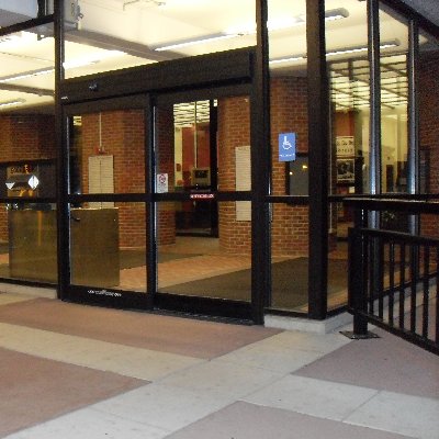
I didn't have as good a view of the left entrance as I did the right from my vantage point (picture to the left is taken from this perspective) and there were people already sitting in the middle, so I decided to focus only on the door closest to me.
The sliding doors seen to the left operate automatically via motion sensors. The left pane slides horizontally to the right, creating an opening on the left. Of the people that used this door incorrectly, the vast majority of their errors involved walking up to the right side.
Here's an overview of the errors made:
- As mentioned above, walking towards the right door. This would be followed by a moment of hesistation before stepping left through the now-revealed entrance.
- Walking to the middle and waiting to see which side opens.
- These doors being on the right, many people entering approached them from the right. I noticed a few people walk sort of parallel to the door, waiting for an opening to appear.
Also of note is that when the door was in active use, meaning others were using it at the time, other people approaching never misued the door. This can be trivially attributed to them simply seeing the door in action and therefore knowing which side the opening is on. I did not include these people in my data.
| Correct | Incorrect | |
|---|---|---|
| Entering | 21 | 17 |
| Exiting | 16 | 0 |

Entering and exiting data for the sliding door.
There was no relevant demographic information to be collected. This door is fully automatic, so it's not, for example, giving shorter or taller people any advantage or disadvantage
Entering vs. Exiting
It seems a little unusual that people were so unanimously able to exit properly after having so much trouble entering. Or is it?
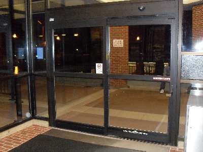
You can see from the image to the right that the back of the door provides no more markings than the front, so it's not like it's more obvious which side opens when you're exiting.
I'll throw around a few of my theories:
- I had a much easier time observing people entering because at that point, their backs were turned to me. People exiting, on the other hand, faced me the entire time, so I tried to be a little less conspicuous. I tried putting on my shades to combat this, but still feel I may have not paid as much attention to exiters because of this.
- Even though the door and windows are mostly glass, it's still in the way of my vision. Observing from inside could have solved this, but there wasn't really a good place to camp in there.
- They messed up 20 minutes ago when they entered and learned.
- In the United States, we drive on the right side of the road. Many people extend this to walking, including myself. It's not much more of a stretch to then have a conceptual model that you should approach the right door, not the left.
Norman's Design Principles
In chapter 1 of Don Norman's The Design of Everyday Things, he outlines some basic terminology of interaction that I will attempt to incorporate here.
- Visibility - This is really the biggest problem with this door. From a brief glance, you should be able to know which side to enter on. There's really very little to distinguish the opening from the non-opening.
- Constraint - The two panes are more or less symmetric and neither hints that it is not a regularly functioning door. Instead of the real opening sliding into something that is physically different from that door, thus preventing people from trying to walk into it, it looks the same and confuses people.
- Feedback - The only feedback comes from the door opening when you trigger the motion sensor. This is pretty much useless in terms of figuring out which side to enter on though because if you didn't know which side to enter on beforehand, by the time you set off the sensor, you're going to be either waiting in the middle to see which side opens or worse, walking into the wrong side.
- Conceptual Model - Continuing with what I said above, most people, including myself, are going to favor the right side. It's the protocol we are accustomed to in the United States and this door clearly goes against the grain of our internal models of how a door should work.
Making It Better
There's no need to spend insane amounts of money reconstructing the entrance to the library. I really think something as simple and relatively inexpensive as those big, black mats you wipe your feet on at the entrances to many buildings would solve the problem here. I believe simply positioning these in front of the side that opens would increase the visibility of the correct side enough to dramatically reduce incorrect usage.
Yes, you could put yellow and black striped warning tape on the wrong door, rebuild the glass wall to make the doors more asymmetrical, or any number of other changes, but in the end, how much do you think university officials really want to spend on something as seemingly trivial as this? Is it that big of a deal that some people stumble for a second or two every now and then? Certainly not enough to justify the cost of construction I'd imagine. This is really something that would have ideally been done correctly in the beginning. At this point, I think something like the mats are really the way to go. They would be asthetically pleasing, cost-effective, and likely get the job done.


